
Design Kit: A Guide For Beginners In Typography

Typography…What is it?
So you want to learn Typography and become a design pro? But you don’t know how it all actually works or how to begin? Well not to worry we have you sorted! In three very easy steps. Here’s how you get started.
First, let’s talk about the word Typography, and it’s meaning. Yes, it’s a noun, meaning style or appearance of text, or in other words “The text art of working with a text”. Cool!, let’s continue….
1. Common Types Of Fonts
To be a pro in design or to make anything visually look more appealing, you need more insight on what font’s work well together and what font’s don’t. So let’s start with the most 3 common font’s used today, and how you can use these font’s correctly to empower more visual content.
Serif: This font is a classic, perfect and well suited for more traditional posts. Such as Magazines, book prints and this article. This Font is one of the most common font’s you will see in books. Like I said it is a Classic and that’s why it is more suited for serious content.

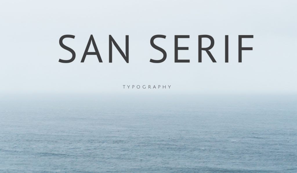
San Serif: This font you find will be more modern and sleek looking. This style of font is more standard for websites and phone apps. Reason being is it’s clearer and easier for readers to read.
Displayed Fonts: Most commonly used for graphics, however, these decorative fonts are fantastic to use and incorporate within a blank or simple canvas. You will find these designs more common through social media sites and design pages.
2. Less is More
I guess you guys have all heard that sweet expression of “Less is more”, well listen up quick remember this. When working with multiple fonts, limit yourself to only two. Yes two, if you really want more, then you may use three, only pending on the subject and nature of your project. For articles stick with two, for Book and Magazine covers or Website banners you can push it to three. However, for the newbies, test it out first with only two fonts.
3. Opposite’s Attract
Well, it’s true, opposites do attract. And when it comes to fonts try these simple complementary tactics, that can make, a significant change to your designs.
Bold x Light

Tall x Short

Decorative with simple


