
How to Craft a High-Converting eCommerce Landing Page

If you’re looking to skyrocket your conversion rate and sell more products, then you need to use eCommerce landing pages.
Seriously, analysis by Unbounce showed that landing pages produce average conversion rates of 4.2% and above.
But the problem is, there’s not a whole lot of information out there about how to build a great landing page for eCommerce stores.
Thankfully, it’s not that hard when you know what you’re doing. In this post, we’ll break down exactly how you can leverage landing pages to power up your conversion rates and build your business.
But before we get to the hands-on stuff, let’s begin by defining exactly what an eCommerce landing page is and why you should care.
What Is An eCommerce Landing Page (and why should you care)?
An eCommerce landing page is a stand-alone page on your store that’s designed with a specific conversion goal in mind. They’re called landing pages because of shoppers ‘land’ on them after clicking on your link.
Here are three main advantages of using landing pages:
1. Landing Pages are Multi-Purpose
One of the best things about landing pages is that you can deploy them for just about any conversion goal.
For example, you can use them to do things like:
- Capture top-of-the-funnel email leads
- Advertise a limited sale or offer
- Promote a specific product or collection
So, unlike product pages, you can leverage landing pages at every stage of your buyer’s journey.
2. Landing Pages Are Laser-Focused on One Goal
Whereas a product page is a general catch-all page aimed at converting a wide array of browsers, landing pages are zeroed in on one goal.
Landing pages typically are made up of specific elements we’ll talk about in a minute such as:
- A headline & sub-heading
- Clear CTA
- Compelling images
- A unique value proposition
Plus, landing pages are often missing other elements like navigational menus that can distract shoppers from converting. To use an analogy, a landing page is like a surgeon’s scalpel – it’s designed for one specific task that it’s very good at.
3. Landing Pages Provide a Better Post-Click Experience
Let’s suppose you’re launching a new sales campaign. You set up, craft your ad creative, define your audience, set your budget, and hit launch.
But after a few hours, you’ve made no sales and your CPMs are through the roof. What’s going on? Well, the problem is you’re driving traffic to your product pages.
Visitors are getting confused, feeling frustrated, and clicking away. Facebook deems your ad is not helping users reach their goals and pumps up your ad cost.
If you had designed a custom landing page for your sale, the next step would have been immediately apparent to visitors and you would have bagged a few sales.
How To Create an eCommerce Landing Page
Not all landing pages are created equal. But the best landing pages typically share similar characteristics.
Let’s look at what you need to build a landing page that converts like crazy. For this, we’ll divide our landing page into two parts; above the fold and beneath the fold.
eCommerce Landing Page Design: Above the Fold
When conversion experts talk about ‘above the fold’ they’re referring to the top of your landing page. The part that’s immediately visible when a visitor lands on your page.
What you include above the fold is important because if you don’t immediately capture attention, the visitor will simply click away. Here’s how:
1. Craft a Benefit-Led Headline
Your headline is your best shot at making a killer impression on your visitor. On average, 8 out of 10 people will read headline copy, but only 2 out of 10 will read the rest.
So, it’s worth putting heaps of effort into crafting a headline that slaps. Some people like to use their business slogan, but another way is to summarize the main benefit you offer readers.
Here’s an easy way to pull benefits out of your product or offer:
- List the main features of your product or service
- Then ask ‘So what?’ about each feature and write your answer beside it
- Now, ask ‘So what? again about your answer.
What you’ll be left with is a collection of juicy benefits that’ll entice your visitors.
For example, look at how one product store Quip has used the ‘So what?’ approach to craft its headline. Instead of saying ‘The World’s Best Smart Toothbrush’ they’ve gone with ‘Better Oral Health, Made Simple’.

The one thing to remember with headlines is that people always want to know what’s in it for them. They don’t really care if you’re the best. They just want to know what you can do for them.
Quip’s target customers have a clear problem – managing oral health is complicated. Their headline gives them the solution they’ve been searching for.
Starting with features and asking ‘so what?’ allows you to craft a headline that does the same.
2. Add a USP-Based Sub-heading
The next thing you want to write is a subheading. Your subheading should communicate your unique selling point and give context to your main headline.
To use Quip as an example again, they do this by appealing to prospective buyers to ‘Guide a lifetime of good habits for all the family.’
This subheading is clever; it appeals to the prospective buyer’s higher values of providing good habits to their children.
Think about what compels your customers to buy your product. What pain points are they struggling with? Brainstorming this way can help you come up with powerful ideas that’ll resonate strongly.
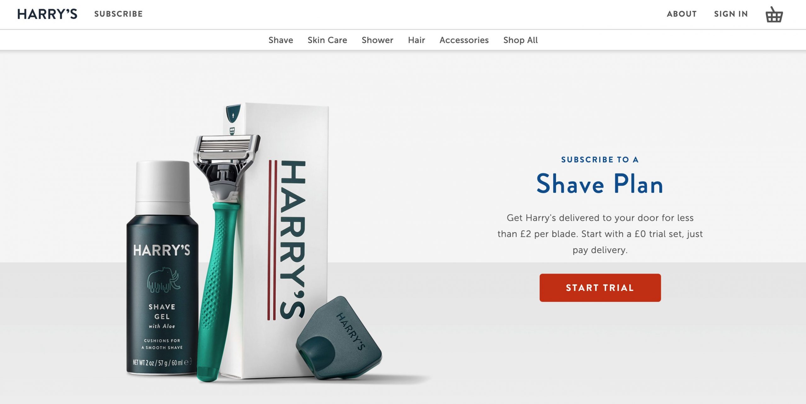
3. Include Amazing Product Visuals
We’re visual creatures. Showing your product off in all its glory is key to winning customers over.
The most common visual layout for landing pages is to position your headline, subheading, and CTA on one half and then position your product visual in the other half.
Here’s a perfect layout example from Harry’s Razors (even if their headline absolutely stinks)
Get access to easy-to-use design and editing tools plus millions of professional stock photos
4. Make The Next Step Clear
Your call to action (CTA) represents your conversion goal. It’s a critical part of your eCommerce landing page.
To get the most number of clicks, you need to make sure your CTA is:
- Highly contrasted to the background-color
- In the shape of a button (not just a hyperlink)
- Surrounded by sufficient white space so it pops off the page
- Is action-based (with words like Start Free Trial, Get 50% Off, etc)
Here’s an example from these principles in action:
It can also be a good idea to sprinkle some scarcity or urgency (e.g. while supplies last) into the copy around your CTA to nudge conversions higher.
eCommerce Landing Page Design: Beneath The Fold
Ok, you’ve successfully grabbed your visitors’ attention with a stunning above-the-fold design. Now we want to seal the deal when they scroll down.
Here’s how:
1. Overcome Objections
Beneath the fold, you want to immediately address and overcome any objections your customers have. All of us know what it’s like to have a moment of hesitation before a purchase.
Ask yourself what are the most common reasons why visitors don’t end up buying your products and address them.
Often customers will wonder things like:
- ‘What happens if I don’t like it?”
- “Can I trust this site?”
- “Does it work, do what it’s supposed to”
- “Is it available elsewhere for less?”
Answering these questions on your landing page will assuage customer anxieties and send your conversion rate northwards.
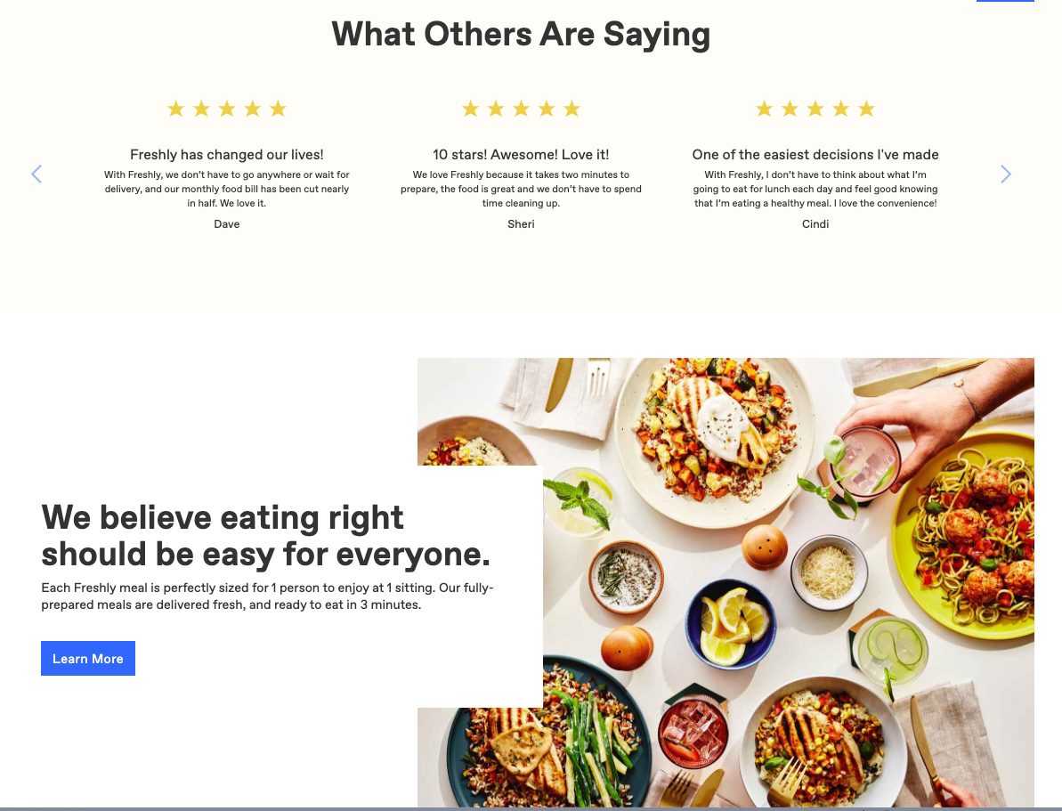
2. Lather on Social Proof
Central to building trust and overcoming objections is that you show customers what others think about your business.
Seriously, social proof is immensely powerful – up to 97% of consumers say that online reviews impact their buying decisions.
So, display customer testimonials and media features loudly and proudly on your landing pages. For example here’s how Freshly does it (personally, I wouldn’t add the link to more reviews – it’s better to keep attention focused strictly on your conversion goal):
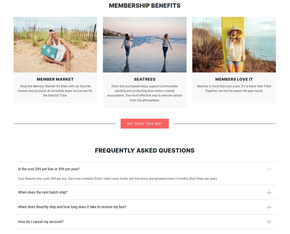
3. Add an FAQ
Customers are bound to have lots of questions. An FAQ page gives them the answers they need.
When writing your FAQ, make sure you re-highlight the benefits of your product or service.
Again, the idea here is to address the reservations your customers have and convince them there’s no need to worry.
4. Put Another CTA at the Bottom
Customers who’ve scrolled the whole way to the bottom of your page are highly interested in your offer. But without another CTA they’ve got to scroll all the way back up to take action.
Instead of making it hard for them, put another tempting CTA at the bottom of your page. This gently reminds them what they need to do next.
Build Better eCommerce Landing Pages Today
Building a landing page doesn’t have to be super-complicated. Just like building your eCommerce homepage, there are a few rules that make all the difference.
With a little know-how and effort, you can create pages that deliver a mesmerizing post-click experience and drive your conversion through the roof.
When building landing pages always think about:
- Your audience
- What you want them to do
And remember that in essence, your landing page is simply a bridge that connects these two things.
Use the tips and examples above to outline your landing page and then just fill in the blanks. In no time at all, you’ll be wondering how you ever settled for 2% conversion rates at all!
The Author:
This guest post was written by Fintan Meagher. Fintan is a content marketer at ReConvert. ReConvert is the easiest way to add thank you page upsells, cross-sells, surveys, and more to your Shopify store.


