
How to Choose the Right Color for Your Brand
Whether you are a start-up or a well-established company, brand colors are closely related to your brand’s marketing. The color palette you choose will help consumers remember your brand and create the brand image you want in people’s minds. This article will tell you all about the psychology of colors and how to choose the right color for your brand.
Research has proven that most customers are attracted to a particular product based on its colors and visual appearance. That said, brand colors are definitely a powerful tool.
Why Do You Need to Choose the Right Colors for Your Brand?
A brand color palette is a combination of colors that represent your brand. For example, you might have a monochrome logo, but your website and other assets use several different colors. The right colors can help you convey a strong message about your brand and increase recognition.
Brand colors are a simple way to communicate your brand’s unique story.
All the colors associated with your brand or used for the products are more than artistic because each has a unique purpose and meaning. For example, red means bold, pink represents femininity, blue is calm, orange represents warmth, and green symbolizes nature.
The right color combination will increase sales and contribute to your brand’s success by influencing certain emotions among your consumer base.
Related Article: Why Color Matter by colorcom
Color Scheme of Popular Brands
The color scheme of popular brands like Facebook, YouTube, and Netflix was created to register them in the audience’s minds. These color schemes have played a major role in growing these brands. Every brand has a little story behind the colors in its brand identity.
Following are some of our favorite ones:
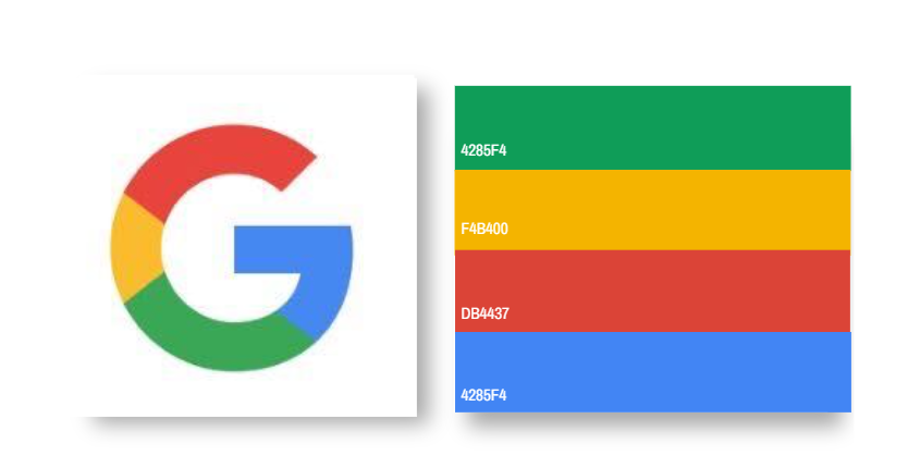
Google – The iconic logo of the world’s most used search engine has become a synonym for the internet. The simple design uses three primary colors to create a multicolor brand identity. But Google added the green color to send the message that they are fun, innovative, and not bound by rules.
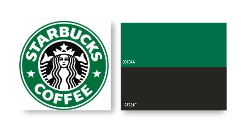
Starbucks – When you see the Starbucks logo, you think of something calm, positive, and relaxing. The combination of deep green with white was a careful selection of colors to provoke these emotions in customers.
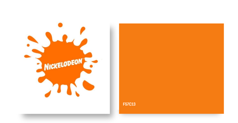
Nickelodeon – The orange represents the fun and joyfulness of Nickelodeon, otherwise known as Nick. At the same time, the white neutralizes to make everything look pleasing.
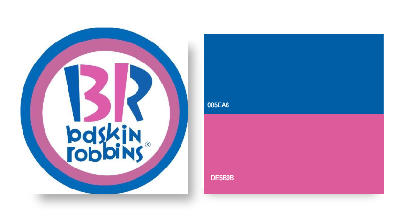
Baskin Robbins – Pink is often associated with something sweet or candy-like, but here it also signifies the BR spoon given for tasting. The blue is for quality.
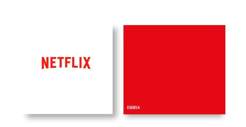
Netflix – Red has always been used to make a powerful statement. In the case of Netflix, red and black are combined to give the classic cinema vibe.
What Colors Attract Customers?
Color psychology explains the more profound impacts of colors and their meaning. Let’s focus on some of the commonly used colors by brands to understand what encourages customers to buy.
Orange – This one is bright but not too loud, like red. It’s an excellent pick for any brand that represents fun. Orange gives off cheerful vibes.
Red – It is a powerful color that can instantly grab attention. A pop of red in your brand color will make it stand out. You can also utilize it as an accent color. Red is a popular choice for edible brands such as McDonald’s, Domino’s Pizza, and Coca-Cola.
Yellow – Symbolizes happiness, and even a small touch of yellow can make everything cheerful. It radiates positivity. The exciting part is that it can be combined with neutrals and vibrant colors. However, the dominant use of Yellow can also overwhelm the onlooker.
Green – It can visually balance other bright colors in the image or design. When used alone, it’s a perfect pick for brands that represent natural or organic products.
Blue – Most people associate blue with calmness as it’s the color of the sky and water. Corporate and tech institutions such as IBM use this as their primary color because it also represents intelligence, professionalism, and responsibility.
Purple – Depending on the hue and color combination, it can serve as a warm or cool color. It represents luxury and spirituality.
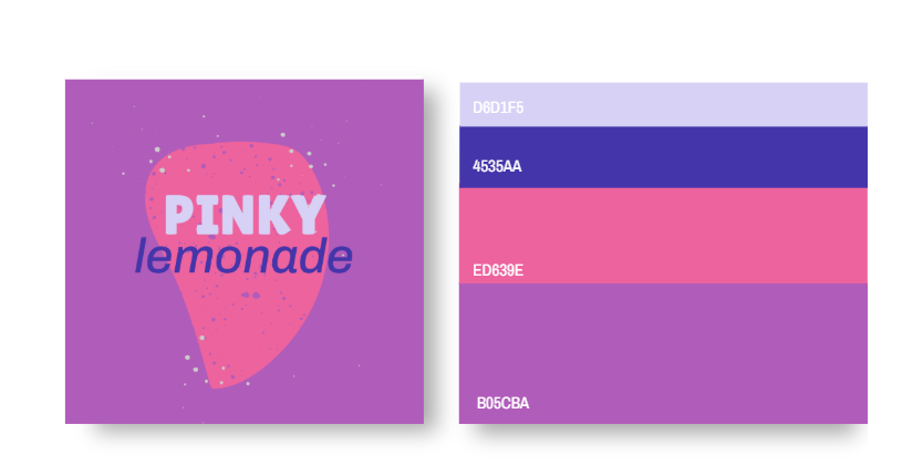
Pink – Pink makes everything worth remembering, and it is often used by brands aiming to attract women.
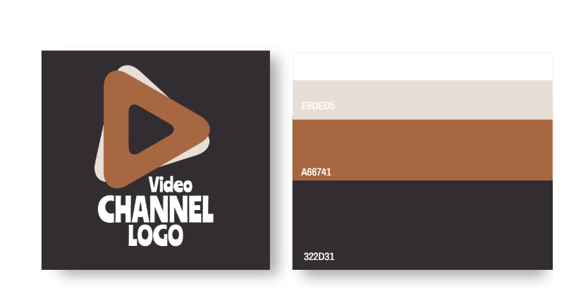
Black – This versatile color can be used alone, or you can combine it with another color related to your brand. After all, you can never go wrong with the classic black color.
White – This minimalist color goes with almost any color you can think of. It sends a powerful yet welcoming vibe—the famous packaging of Apple in white looks minimalist yet stylish.
Consistency is the key to making your brand unforgettable. Professional designers recommend choosing a limited brand color palette to maximize the impact. You can have multicolors for your brand, but all of them should be used in harmony. After finalizing your colors, select the color scheme you will use to relate them.
The four common color schemes are:
- Monochromatic
- Complementary
- Analogous
- Triad
![]()
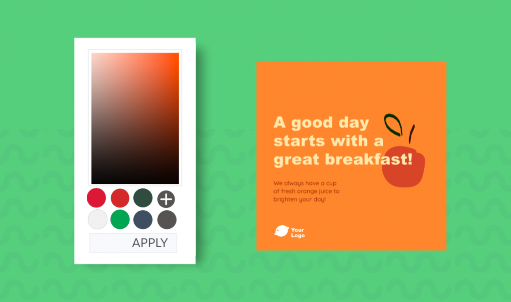
Creating a Brand Color Palette
Before you get started with choosing the right color palette, focus on the following questions:
- What are your brand goals?
- What is your targeted audience?
- How do you want the customers to feel about your brand?

Do you want the audience to think of your brand as something fun, positive, or natural? Maybe you are targeting kids, teenagers, or women. Having the answers to the above will help you in finalizing the color scheme. Remember, pink might be your favorite color, but it does not necessarily represent your brand, so give some thought to what you choose and why.
Find inspiration. It could be how your brand was created or anything related to the products or services you offer. Pay attention to competitor brands and ensure that your colors stand out among them. Just because most tech companies go for blue does not mean you have to do the same.
Choosing the same colors might make your brand less prominent. However, you can be creative and choose new colors to represent the brand’s values.
You can play with the standard colors to develop a new shade that is personalized but successfully delivers the message. This is done by adjusting the shade, hues, tint, and saturation of the colors.
Lastly, it’s essential to know the color codes in different color types like RGB, HEX, and CMYK.
There are no fixed rules as to how many colors should be added. But if you want to add some diversity to your color palette, at least three colors are recommended.

The first one is the base color; it represents the brand identity. This is the primary color; everything else is matched with this one.
The second one is the accent color. You need to be mindful of this one because it should complement the base color but still represent the brand. The last one is a neutral background color which should not grab attention but give a clean canvas to help the first two colors stand out.
Having a brand color palette is important in building your brand identity. With the right tools, such as Desygner, you can create the color palette, brand guidelines, and brand identity. You can store the brand colors in your assets library to access them easily. You do not have to be a designer or color expert to create a brand palette with Desygner.
Final Thoughts
Colors help attract viewers’ attention. The brand colors should be included in everything used to communicate with customers; this consists of the logo, cards, advertisements, company emails, and the website. Always go for colors that highlight the strength and goal of your brand to attract the right audience and make it memorable.


