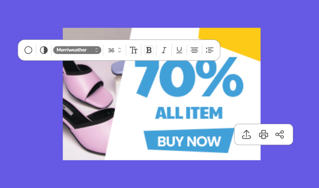
10 Facebook Ad Design Tips That’ll Boost Your Ad Conversion
Picture the following scenario: You’re aimlessly scrolling through your feed, and Bam! Out of the blue, an amateur Facebook ad design hits you, and you’re not sure what to think. A blurry image, an inconspicuous message, and glaringly unprofessional visuals. It’s only natural to mark such an ad as spam and a waste of time, right?
It may look easy, but getting started with ad design can be quite a hassle. After all, there’s so much to take into consideration. It comes as no surprise that brands and marketers alike feel stumped when it’s time to head back to the drawing board to design the next ad for their marketing campaign.
In this blog post, we’ll discuss the top 10 Facebook Ad Designs to get your brand on the right track to converting as many prospective consumers as possible!
10 Facebook Ad Design Tips
The following tips will help you optimize your Facebook Ads design to increase conversions and build a solid brand image.
1. Correct Facebook Ad Sizes
Once you’ve begun designing your ad, double-check that your images or videos are the proper size and aspect ratio. Images and videos not correctly formatted are distorted, grainy, or difficult to see.
You can fit in all the necessary information with the proper aspect ratio while avoiding wasted space or awkward margins. The aspect ratio is the relationship between the width and height of a rectangle or other two-dimensional shape. It will make the design more effective and easier to read. It will also keep your audience focused on what they should be paying attention to. The result? A highly professional Facebook ad design that conveys the idea effortlessly.
Keeping track of all the aspect ratios and image sizes is a hassle. Don’t worry; we’ve got your back! Simply bookmark our guide to Facebook ads design size, so you’ll never have to worry about design sizes again!
2. Design Considering the Ads Placement
The placement of your Facebook ads is just as important as the format itself. Ad placement determines the amount of space you have, and designing without ad specs in mind can be disastrous.
You must first understand your options to select the best Facebook ad design placement for your goals. Here is a list of some of the most common ad placements, as well as tips on how to use them effectively:
- Desktop News Feed: Excellent for increasing engagement and generating sales and leads. Longer copy and link descriptions support this kind of format.
- Mobile Newsfeed: Excellent for interaction and discovery. However, the copy here must be concise because it must be shorter.
- Stories: Facebook stories require creative input that is unique, full-screen, and mobile-friendly. Story videos are limited to 15 seconds in length. With over 500 million users watching Facebook stories daily, the realm of Facebook stories for marketing is brimming with potential!
3. Personalize Your Facebook Ads To Target Specific Audiences
For starters, try to tune your Facebook ad design to match your audience’s vibe. To get to know your audience better, you can use an ad tracking tool such as Voluum that gives you a detailed insight into visitors and conversions.
If you’re targeting youngsters, incorporate bright, catchy colors and focus more on Facebook Stories, which, in this case, are quite popular with the target market.
Make sure your ad message always matches the interests of the audience you’re trying to target. You can also use targeting options to show your ad only in front of people who have shown interest in your niche. If you’re trying to sell products or service that caters specifically to men over 40, then don’t waste money exhibiting them to women between 18 and 25 who are interested in beauty & fashion. Otherwise, all your hard work is likely to go to waste.
4. Emphasize the Value of Your Offer (Value Proposition)
According to Facebook, mobile users spend an average of 1.7 seconds browsing an individual post. You may think that’s next to nothing, right? However, we’re here to tell you that with the right strategy, even a second is more than enough! What matters is how well you can integrate your value proposition into the design.
When creating your ads, remember that people will only give you a few seconds to impress them. Use that time wisely by emphasizing your value proposition while keeping your clear and actionable call to action. Use a strong headline that has a clear benefit and clearly describes what they will find on their website.
5. Use High-Quality Images and GIFs
According to Facebook, “shorter videos get more complete views.” After all, a fifteen-second video ad is more likely to be seen to completion rather than a minute-long video. This is where high-quality images and GIFs enter the picture.
See, GIFs are visually appealing. They distinguish themselves from images and do not require the same effort as video, carousel, and lead ads. Similarly, high-quality images pull in all of the benefits associated with GIFs, except that these are comparatively easier to make.
Last but not least, pre-existing video assets can be repurposed to create eye-catching GIFs and images to boost consumer ad engagement!
6. Make Your CTA Button Stand Out
Your call to action (CTA) buttons are the lifeline of your online business. They should elicit a sense of urgency and stand out on your page. Each CTA, in essence, asks your visitors to do something about the product or service they like.
Your CTA should stand out from the rest of your content in terms of design. It should be simple to identify and understand; you want visitors to understand what it represents and where it is on your page.
You also want it to be visually appealing. You don’t want visitors clicking away because they don’t like the look of it. This can be achieved by using complementary and contrasting colors and fonts that match your brand identity.
7. Use Simple Text
To put it into simple terms, flowery, over-the-top language will muddle your message. It’s time to cut the jargon and get straight to the point.
Your top priority should be to create a Facebook ad with minimalistic graphic design and language. This way, anyone with a decent understanding of the language can understand. When someone sees your advertisement, they should immediately recognize the following:
- What you’re offering
- How it’ll help them
- What is the next step?
8. Choose a Template that Suits the Objective of Your Ad
Before you dive into the nitty-gritty of how an ad will look, you must first decide which ad format you will use. Each design caters to different audiences and goals, so you’ll have to choose wisely!
Currently, Facebook has eight main ad formats. Some of the most popular include:
- Photo: The most basic format, compromising a single image with a short header for the copy. Using this approach, you’d be best suited to concentrate your efforts on telling a compelling visual story with a single image.
- Video: Videos formats are quite similar to the aforementioned image format- the key (and only) difference being that, in this case, an entire video is being showcased, giving you more time to showcase your brand.
- Stories: Stories live outside the feed and immerse viewers in a full-screen experience. Capture their undivided attention by using all of the room you can to make an impression.
- Messenger: Facebook delivers these advertisements to your customers via the Facebook messenger app. In our opinion, with Messenger, your best bet is to utilize short sentences and images with a single focus to attract your customers.
Consider how each ad format can be used to maximize the impact of your ads before you begin the design process. For example, if you want to demonstrate how your product works, a video or story ad may allow you to do so. Similarly, you could potentially use Stories to showcase real estate—a popular strategy nowadays!
9. Make Sure Your Ads Are Mobile Optimized
As of January 2022, Statista reported that nearly 98.5% of users accessed their Facebook accounts from mobile devices. Compare this to a disparaging 1.5% for laptops or desktop computers, and you can see why optimizing your ads for mobile is such a make or break in most marketing strategies. Your Facebook ad design strategy needs to be mobile-first to yield the best returns.
Making your videos and images vertical, so they work better on phones is one of the simplest ways to think mobile-first. Moreover, it’s also best to keep the text to a minimum to allow the videos to speak for themselves.
10. Test, Test, And Test Again!
Use split testing to find the right Facebook ad design. Predicting public response to a specific advertisement always entails a certain degree of risk. After all, you can never correctly gauge the entire audience’s reaction to a particular ad.
With split testing, advertisers can determine which version of an ad performs best. With this information, they can learn and optimize ads for optimality. A/B testing, which is available in Facebook’s Ads Manager, can be used to conduct the split testing.
A/B testing on Facebook
A/B testing is a marketing strategy that compares the effectiveness of two different versions of a website, advertisement, email, popup, or landing page.
Testing, when done consistently, can significantly improve your results. It’s easier to make decisions and create more effective marketing strategies if you know what works and what doesn’t, with evidence to back it up.
Key Takeaways
The success of an ad campaign is determined by approaching and targeting the appropriate audience base, content, creative visuals, and other pertinent factors. All of these lie on Desygner’s playing field.
Thus, to remain updated with the latest trends in ad designs, follow Desygner on Facebook, Instagram, LinkedIn, and Youtube today!


