How to create an event poster design online
“Hey, look at that poster! That party looks like it will be epic…”
This could be what people say when they see the event poster that you made after reading this article.
We’ll learn with these event poster ideas:
- Arrange the layout of your texts.
- Choose good backgrounds for your event posters.
- Also, colors.
- If you’re too lazy, use free templates 🙂
If you’re eager to jump into the design process straight away then check out this tutorial for a quick overview on how to use Desygner to make an eye-catching event poster.
Be sure to read further below for our best tips on how you could make your poster stand out. With this article, your event will be hoppin’. Design your poster!
1. Arrange Your Texts
Name of your event
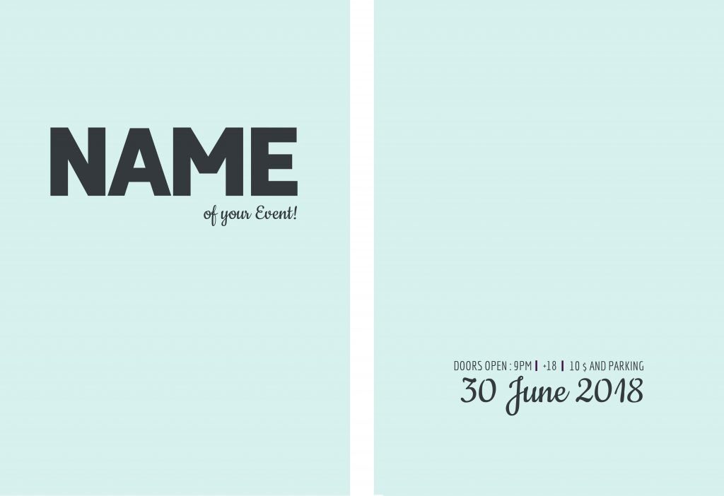
To know how to design an event poster that makes an impression, you have to emphasize the name of your event. If the name of your event stands out on the poster, it will be remembered for subsequent events.
- Use a very large font size. Try to take up a good part of your poster.
- Create posts with contrast between the background color and headline. Use a background color that brings out the text of your event.
Date of your event
If you can catch somebody’s eye with your poster, it’s ideal if he/she remembers the date of your event. So, arrange it well and use the right font size.
- Use a font size that’s big enough but secondary.
- Don’t make it the same size as the name of your event.
You certainly wouldn’t be too happy if that person wanted to share your event with a friend and couldn’t remember the day of your awesome costume party.
Of course, they could go back to look for your poster, but they would have to be very interested to seek out the information all over again.
Add a Tagline
Once you have the name of your event, which you’ll highlight along with the date, you can’t forget to add a catchy tagline.
People who see your poster will always choose to go to your event if the tagline gives off positive vibes.
To design an event poster with one of these taglines, you have to devote some time, since they can create controversy and believe me! You don’t want that for your event. You’ll have to consider these points:
- Audience Target: Women? Men? A mix? Young people? Older people? etc.
- Say something about your event: Express surprise or fun. To dance? Have a good time? Listen to good music? Is it swanky?
- Don’t write a book: Try to capture the public’s attention with a short phrase of around 3-5 words.
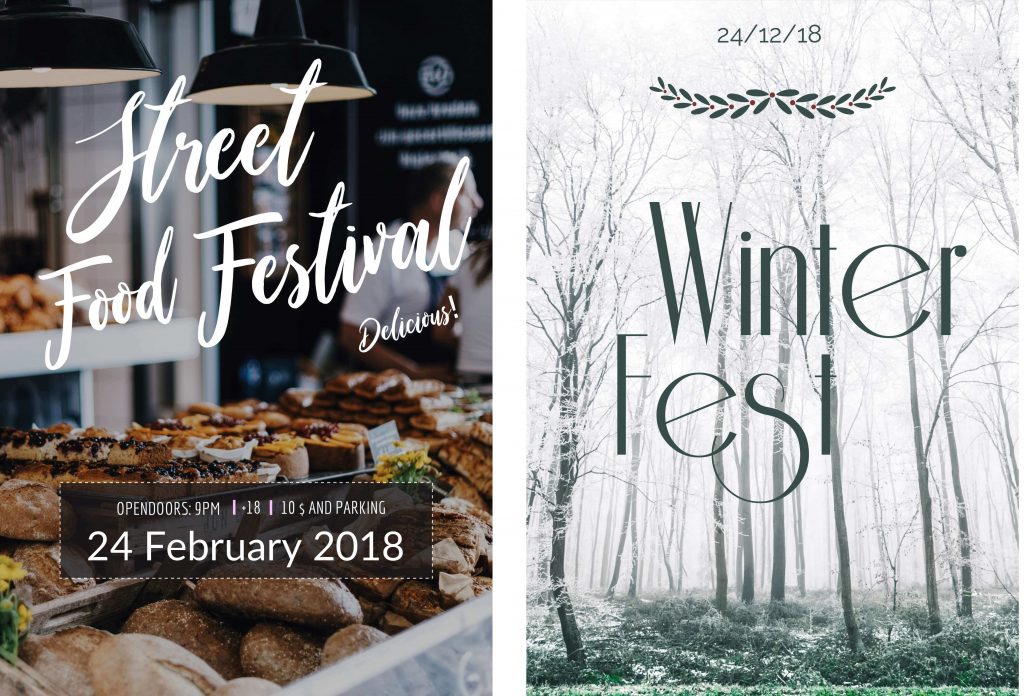
You can see examples of these taglines on posters that appear in this article
Simplicity for all additional info
Try to make sure additional info doesn’t take away from the most important info (name and date).
Additional info could include: Entry age, address, start time, social media, discounts, etc. Use elegant and upscale fonts – they’ll look great.

2. Choosing Backgrounds for Event Poster
Make all the people who see your poster stop and say: “Hey! I want to be there!”
- Look for a photo, image or pattern that makes an impression.
- Choose a relevant and appropriate background for your event.
Trendy background colors
Every year, there are certain colors that go in style. For example, in 2018, two-tone or gradients will be everywhere, so it’s a great idea to use them in your designs.
On Freepik or our integrated image search engine, put in the word #gradient and you’ll find many backgrounds like this that will be all the rage.
Let’s see how these colors look with a thick, large font to highlight the name and date of your event, as I mentioned earlier.
They look great. Am I right?

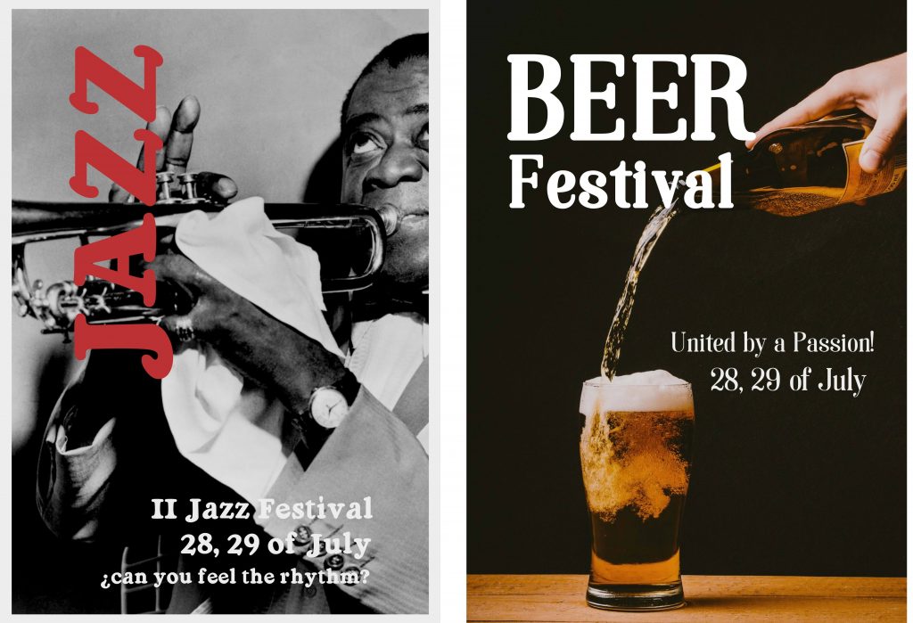
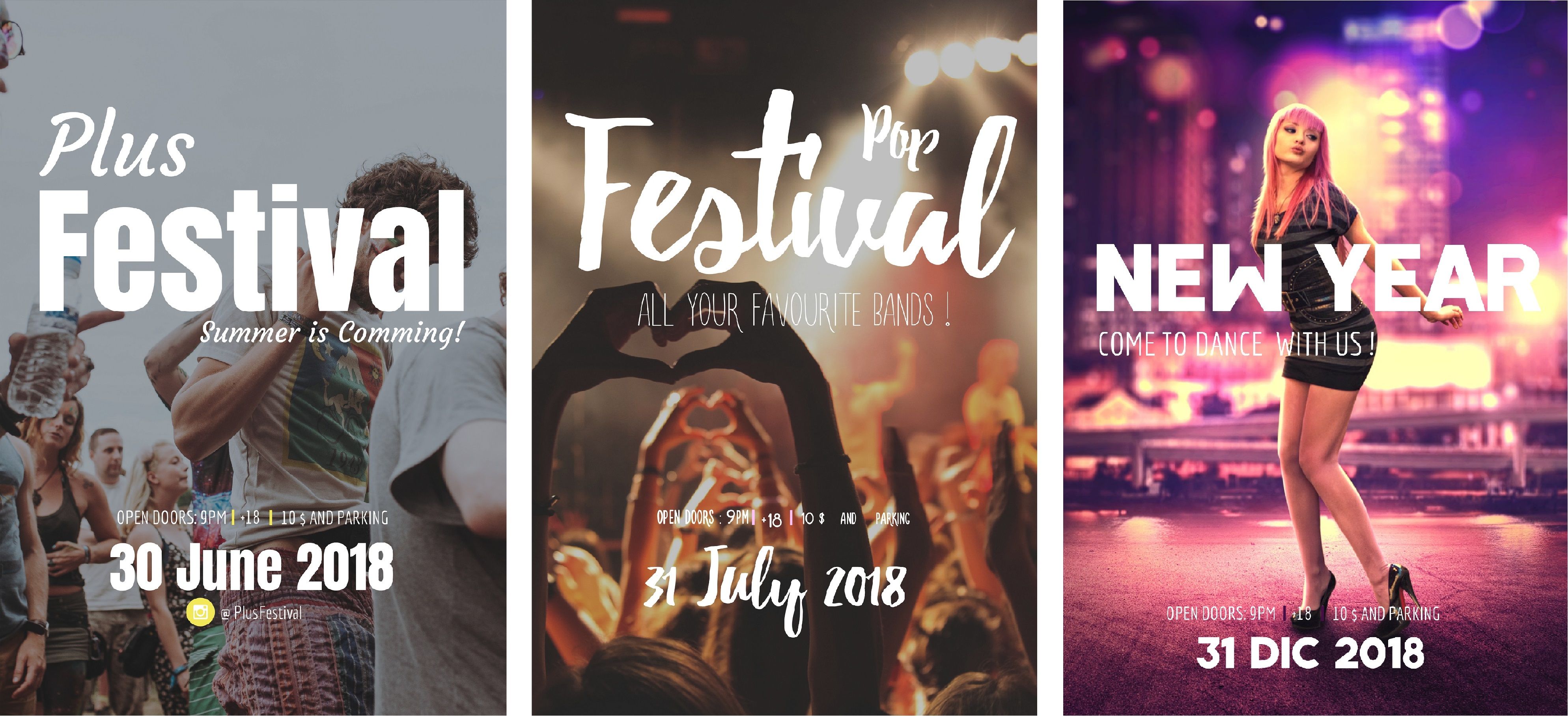
Use photos of festivals, concerts or dancing people
If you see a poster for an event with some high-quality photos where the guests are having a good time, it obviously will make you want to go and dance the night away! Look at these posters:
Can you resist?
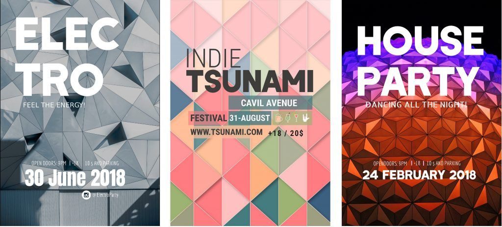
Geometric shapes
Geometric images are very useful for dance, electronic or house parties. Choose professional images with striking colors and they’ll look perfect.
To find these background images, I use keywords and put them in Desygner’s integrated search engine: party, dance, concert and geometric.
Patterns
Patterns never go out of style and you have infinite options to choose from. Animals, flowers, geometric shapes, clouds, etc.
Important: If you adore patterns, be careful with your text! Text over a pattern won’t be very readable in most cases.
How can we solve this problem? Don’t worry!
You just have to use shapes
You can use a square, a rectangle or even a circle behind your text. For shapes, use the same colors in your pattern, as well as increasing the transparency to give it a sheer look.
This will make your text stand out and let you see the pattern too.

Your own images
If you use your own photos, make sure they are high-quality. This will make your party poster look more professional.
- Don’t use photos taken with your cell phone.
- Take photos with a somewhat professional camera.
If you don’t have this type of camera, you can always use our search engine or one of my favorite pages for copyright-free images: Photodexia.
3. Use creative colors
There are thousands of colors to give you ideas for your poster, we know that. I may like blue shades and you yellow shades. Who knows? But there are 3 key basic rules:
- Choose colors that reflect the type of party you want to throw.
- Use the same colors for the background as the text.
- My recommendation is to use between 3-4 colors.
¿How to create a color palette from an image?
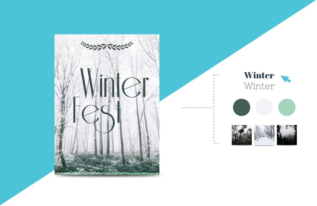
In the Desygner editor, you can use the paintbrush option:
This will make your life easier. With this tool, you can click on the background image and choose the color you want. Use similar colors and create contrast for your text.
Create a Pallete Color from an image
Alguna vez te preguntaste ¿Cómo crear paletas de colores desde una imagen? ☝ ¡Con la herramienta "Seleccionar Color" es muy sencillo! 👏Visita Desygner: 🔹http://bit.ly/2LQUH1W🔹
Posted by Desygner on Monday, September 3, 2018
Event Poster Templates
If you like to do things quickly, you can always use our Desygner templates. They’re ready for editing and printing:

Create a Desygner account for free:
Sign Up
- Choose your template.
- Edit whatever you need to.
- Look for the right background for the type of event.
With Desygner’s integrated search engine, you can quickly find copyright-free backgrounds for your party poster. What does this mean? You can use these images for commercial purposes!
Lastly, here’s a video tutorial to add to these wonderful poster ideas, using one of Desygner’s templates:

