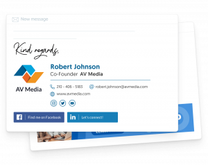
The Ultimate Guide to Designing a Stunning Email Signature
An email signature is one of the final points of communication a company has with a customer. Although first impressions are key to acquiring new clients, the last impression is the icing on the cake.
Businesses use email signatures to promote their brand and to show professionalism. In fact, 82% of email marketers use signatures to boost brand awareness. This is a proven method to increase the click-through rate and drive more customers to landing pages or corporate sites.
Do you want to learn how to write a great email signature? Keep reading and discover why you need an email signature for your business and useful tips for creating an eye-catching email signature design.
What is an Email Signature?

Source: Uplers Email
Design Your Email Signature Now
An email signature is a digital business card. It’s located at the end of a mail message, and it gives information to the reader about a company or a professional. It includes basic data such as the brand name, phone number, and links to the business site and social media profiles.
An email signature must be:
- Professional — build a great brand reputation. If you spend time designing an elegant email signature, customers will perceive you as an established business.
- Informative — tell your reader who you are, what you are doing, and how they can find you. An email signature answers the most important questions about yourself and your brand’s personality.
- Simple — go straight to the point. Add only relevant data to your business activity. Create a signature that’s easy to read and provide your contact information.
- Authentic — find inspiration from your competitors and use an email signature generator, but don’t copy. Follow your brand guidelines and design a memorable signature that reflects your company’s identity.
Why Do I Need a Professional Email Signature for my Business?

Source: Elegant Themes.
Design Your Email Signature Now
Email marketing is on the rise. The number of worldwide email users is expected to grow to over 4.9 billion by the end of 2023.
Are these stats relevant for your business? Absolutely. Customers often prefer emails to any other type of channel to interact with a company. They are more intimate and personal than social media ads or push-up notifications.
Email signatures play a huge role in your email marketing strategy. They give recipients an overview of your business activity and embody reliability. A professional email signature is a sign of respect toward your audience and a perfect closing to a message.
An email closing can be decisive in converting leads into sales. It motivates prospective customers to answer back, take action, and get familiarized with your brand. If you use friendly language and an effective call-to-action (CTA), you’re more likely to get a positive response.
How To Design an Outstanding Email Signature
1. Keep It Simple

Source: Wise Stamp.
Related Article: 7 Key Principles of Minimalist Graphic Design
An email signature is not an autobiography. When writing yours, try to add only the most important information about your business.
Your customers appreciate concision. Don’t go off the rails: sell yourself in a few words to make your message resonate with your audience. Ask yourself the 5Ws before creating your signature:
- Who — who are you?
- What — what do you do? What are the products or services you offer?
- When — when can your customers contact you, and how?
- Where — where is your business located?
- Why — why do you want to connect with your clients? Why do you use social media links and CTAs?
There aren’t set rules on how big or small an email signature should be. To make your message as short as possible, marketing experts recommend writing 3-4 lines of text and keeping it to 300 x 600 pixels.
Logos and pictures are elements you can include in your signature. These must integrate into the email signature layout smoothly and never distract the audience from the main message. Remember that images are complementary items, so don’t overuse them. A business logo speaks of trust, while a picture of a smiling face is welcoming and joyful.
2. Be Consistent

Source: Mi-IT.
Consistency is crucial to creating a good-looking email signature. It gives authority to your company and builds trust among customers.
Whether you’re a young professional or a business owner, you shouldn’t overlook the influence an email signature has on building brand image. Did you know that 50% of employees who work in mid-sized businesses send 11 to 25 emails per day? That’s a ton of emails!
Having a uniform email signature across a company can help to promote their services in a non-intrusive way. Every time an employee sends a mail, the brand’s reputation is on the line: a well-structured signature makes a business look more competent, and it can ultimately close a deal.
Hierarchy is fundamental to designing your email signature. Place the essential elements on top to catch readers’ attention and follow a logical structure.
Your full name should be the centerpiece of the signature. You can use larger font sizes to emphasize your personal brand and highlight yourself as an industry expert. If done well, people will remember your name first when they need professional services in your business field.
From top to bottom in the hierarchical scale, these are the key elements you need to include in your email signature:
- Full name and surname/name of the company/brand — i.e., John Hamilton
- Position/role/expertise/industry — i.e., SEO consultant
- Business address/place of residency — i.e., 123 West 74th Street, New York
- Contact information — i.e., 678345619, johnhamiltonseo@gmail.com
- Business website/portfolio — i.e., https://newyorkseoservices.com
- Social media icons — i.e., links to Facebook, Instagram, and LinkedIn profiles
- Animations/videos/offers (optional) — i.e., business services promotional video
- CTA link or button — i.e., ‘buy now, ‘read more’ or ‘join us’
3. Use a Gentle Color Palette
Source: GraphicsFamily.
Related Article: How To Choose The Right Color For Your Brand
Minimalism is a virtue when designing a professional email signature. A simple layout is not only easy to read but also pleasing to the eye.
To make a visually-appealing signature, you need to use a gentle color palette. Follow your brand guidelines to choose the design and align it to the graphic material you’ve produced over time.
This creates a sense of continuity: customers that read your signature and click on a CTA will land on a page that shares the same colors and artwork with the email.
How can you make the most out of your brand color scheme and build a stunning email signature? Check out these tips and start creating your new signature today:
- Use 2-3 colors — less is more. Pick 2 or 3 colors and use them for your letter font and other elements. If your logo is colorful, stick to a neutral color to write your signature headline and text.
- Soft tones are satisfying — soft color tones are often more aesthetic than heavy ones. They set a calm and positive ambiance that improves comprehension.
- Dark fonts are the standard — dark fonts are best for readability. Email signature backgrounds are normally white, so black or navy blue fonts are very legible and help in reading.
- Play with the emotions — colors communicate emotions. Red inspires urgency and excitement; green and blue show quality, peace, and trust.
- Combine colors with care — certain colors just don’t go together. Avoid over-the-top and kitsch designs. Go with what you know already works.
4. Add Social Media Icons
Source: Shopify.
Social media allows businesses to contact customers instantly and reach new audiences on multiple platforms. According to a study by DataReportal, 93.4% of all internet users are social media users. This means that the vast majority of your current and potential clients are sharing and consuming social media content.
When you add social media icons to your email signature, you’re inviting people to get to know you better. Customers can discover a more personal and friendly face of your company, a space where they feel more comfortable and free to interact with your brand.
Do you usually post special offers or links to your blog on social media? If so, you’re doing the right thing. Clients that click on your Facebook or LinkedIn logo will find a new path to visit your website. You’ll drive customers from their inbox to your social media channels and ultimately to your site. To keep visitor retention consider using the social media post maker from Desygner.
Consider using these hints to add social media icons to your email signature and increase traffic to your website:
- Align the design — choose social media icons that mirror your signature’s design. If you go for a rectangular frame design, the icon’s shape should also be rectangular.
- Add relevant social media icons — the rule is simple. Do you post regularly on Facebook? Add the icon. If the last time you posted on Instagram was in 2015? Don’t add the icon.
- Use the right icon — social media channels have their brand guidelines, and you can access them for free. Here’s an example of Linkedin’s brand guidelines, where you can find a guide on how to use their logo and download it.
- Keep it consistent — platforms allow businesses to adapt their logos to different designs and use more than one logo variation. When adding social media icons, try to use the same logo in all your communications, from your website to your email signature.
5. Add an Eye-Catching CTA

Source: HubSpot.
Design Your Email Signature Now
A CTA turns clicks into customers. These links or buttons guide users to complete a specific action like making a purchase.
Adding a CTA to your email signature makes people’s life easier. After reading your contact information, clients have the chance to go to your site to buy a product or sign up for a service.
How can you convince users to click on your CTAs? Check these proven CTAs practices to maximize conversions:
- Create a CTA that stands out — attract your customer’s attention with a bright and clean CTA design. The best three colors for CTAs are red, green, and orange/yellow.
- Use imperatives — verbs like ‘download’ or ‘sign up’ are great to promote conversions. An effective CTA speaks to the readers and persuades them to perform an activity immediately.
- Place the CTA at the bottom of your message — the CTA is the last thing customers should read. If you place it before your contact information, the email signature may seem too sales-focused.
- Say the benefit — be direct and tell the user what you offer. Do you want them to subscribe to your newsletter? Use ‘Subscribe to our newsletter’ as your CTA copy. Are you promoting a product discount? Write ‘Get 10% off your next purchase.’
- Be short — concision is important to business writing because it’s straightforward. People don’t have time to read long texts before buying a product. Be brief and transparent when creating a CTA, and you’ll be more likely to succeed.
Once you’ve added a CTA to your email signature, you must track the results. This way, you can learn what words and sentences are working and which ones are not performing as expected.
To get a clear overview of your data, use a tracking code. If you want to access and analyze CTAs stats in real-time, install professional email signature software.
Hire a Professional Designer

Final thoughts
Email signatures are an important part of your marketing strategy. They show you care about your product, and it’s proof of professionalism.
There are many benefits of using an email signature in your business. It can help you boost brand awareness, promote your services and build trust with your customers.
Feel free to use the tips we’ve compiled in this article and enhance your brand with email signature branding.
About the Author

Helga Zabalkanska leads MySignature team. Believes that product and growth marketing are driving forces to succeed in your 6 figures goals.


